Building a Responsive Contact Form: A Step-by-Step Guide using HTML & CSS
In this article, we will learn to design responsive contact form. As we know, in the digital era, where the majority of internet users access websites through smartphones and tablets, having a responsive website is no longer a luxury but a necessity. Responsive design ensures that your website looks and functions seamlessly across all devices, offering an optimal user experience. One crucial element of any website is a contact form that allows visitors to get in touch with you. In this tutorial, we will guide you through the process of creating a responsive contact form using HTML and CSS, enhancing user engagement and satisfaction
The Importance of Responsiveness in Web Design:
Before delving into the technical aspects, it’s essential to understand why responsiveness matters. As we know, Google and other search engines prioritize mobile-friendly websites in their rankings. A responsive design not only improves your SEO but also reduces bounce rates and increases the time visitors spend on your site. By ensuring your contact form is responsive, you create a positive impression and encourage visitors to reach out, ultimately boosting your conversion rates.
Step 1: Setting Up the HTML Structure:
Start by creating a new HTML file and defining the structure of your responsive contact form. Begin with the <form> element, specifying the action (where the form data will be sent) and the method (usually POST).
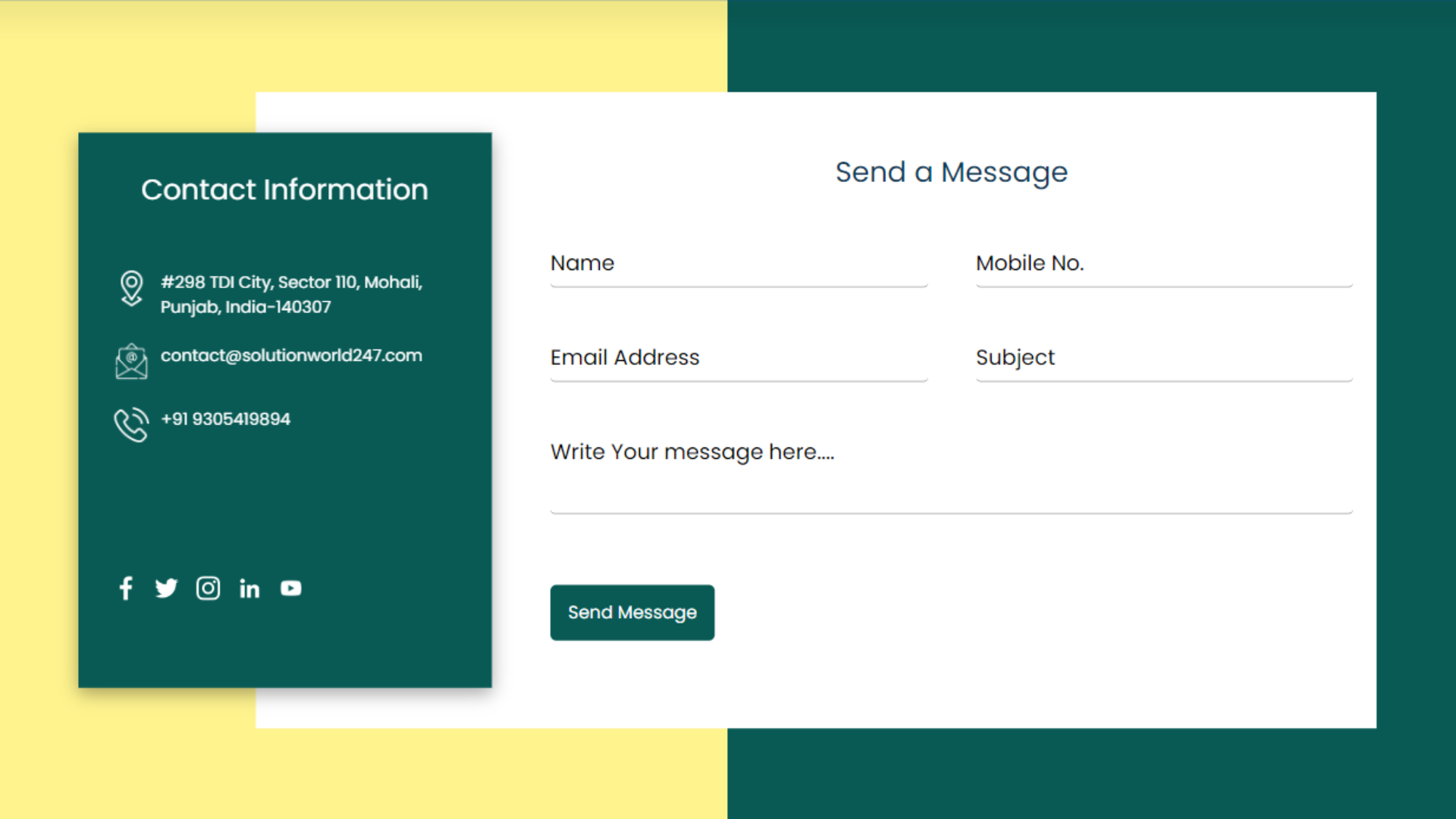
<section class="main-box">
  <div class="container">
    <div class="contact-form d-flex">
 <div class="contact-info">
   <h2>Contact Information</h2>
   <div class="listing-box">
      <ul>
       <li>
         <span>
           <img src="/Img/location.png">
         </span>
         <span style="font-size: 14px;">Mohali, Punjab, India-140307</span>
       </li>
       <li>
         <span>
            <img src="/Img/email.png">
         </span>
         <span style="font-size: 14px;">
           contact@solutionworld247.com
         </span>
       </li>
       <li>
         <span>
            <img src="/Img/phone-call.png">
         </span>
         <span style="font-size: 14px;">
           +91 9305419894
         </span>
       </li>
       <li></li>
      </ul>
   </div>
   <div class="social-icons">
     <ul>
       <li>
         <a href="https://www.facebook.com/solutionworld24x7/"><img src="/Img/facebook.png"></a>
       </li>
       <li>
         <a href="https://twitter.com/Solution__World"><img src="/Img/twitter.png"></a>
       </li>
       <li>
         <a href="https://www.instagram.com/solutionworld24x7?r=nametag"><img src="/Img/instagram.png"></a>
       </li>
       <li>
         <a href="https://www.linkedin.com/company/solutionworld247/"><img src="/Img/linkedin.png"></a>
       </li>
       <li>
         <a href="https://www.youtube.com/@SolutionWorld24x7"><img src="/Img/youtube.png"></a>
       </li>
     </ul>
   </div>
 </div>
          <div class="info-form">
             <h2>Send a Message</h2>
             <form>
              <div class="inner-form">
                 <div class="input-box content-width">
                    <input type="text" name="name" required>
                    <span>Name</span>
                 </div>
                 <div class="input-box content-width">
                    <input type="text" name="phone" required>
                    <span>Mobile No.</span>
                 </div>
                 <div class="input-box content-width">
                    <input type="text" name="email" required>
                    <span>Email Address</span>
                 </div>
                 <div class="input-box content-width">
                    <input type="text" name="subject" required>
                    <span>Subject</span>
                 </div>
                 <div class="input-box content-full-width">
                    <textarea required ></textarea>
                    <span>Write Your message here....</span>
                 </div>
                 <div class="button-area">
                  <button type="submit">Send Message</button>
                  <span style="font-size: 12px; margin-left: 10px;"></span>
                </div>
              </div>
             </form>
          </div>
    </div>
  </div>
</section>
Step 2: Styling with CSS:
Now, let’s style the form to make it visually appealing and responsive. Create a new CSS file and link it to your HTML document.
.main-box{
  background: linear-gradient( to left, #095a55 0%, #095a55 50%, #fff38e 50%, #fff38e 100% );
  height: 93vh;
  display: flex;
  justify-content: center;
 align-items: center;}
.contact-form{
  position: relative;
  width: 1100px;
  height: 550px;
}
.contact-form .contact-info{
   position: absolute;
   width: 350px;
   top:40px;
   height: calc(100% - 120px);
   background-color:#095a55;
   padding: 30px;
   display: flex;
   justify-content: center;
   flex-direction: column;
   justify-content: space-between;
   z-index: 9998;
   box-shadow: rgba(0, 0, 0, 0.35) 0px 5px 15px;
}
.contact-info h2{
  color: #fff;
  font-size: 24px;
  font-weight: 500;
}
.contact-info ul{
  position: relative;
  margin: 20px 0px;
  padding-left: 0px;
}
.contact-info ul li{
   position: relative;
   list-style: none;
   display: flex;
   align-items: flex-start;
   margin: 20px 0;
   cursor: pointer;
   align-items: flex-start;
}
.contact-info ul li span:nth-child(1){
   width:30px;
   min-width: 30px;
}
.contact-info ul li span:nth-child(1) img{
   max-width: 100%;
   filter: invert(1);
}
.contact-info ul li span:nth-child(2){
   color: #fff;
   margin-left: 10px;
   font-weight: 300;
}
.contact-info .social-icons ul{
  position: relative;
  display: flex;
}
.contact-info .social-icons ul li{
  list-style: none;
  margin-right: 15px;
}
.contact-info .social-icons ul li a{
  text-decoration: none;
}
.contact-info .social-icons ul li a img{
  filter: invert(1);
  width: 20px;
}
.contact-form .info-form{
    position: absolute;
    background-color: #fff;
     box-sizing: border-box; /* Add this line */
    padding: 50px 20px;
    width: calc(100% - 150px);
    padding-left: 250px;
    margin-left: 150px;
    margin-top: 5px;
}
.info-form h2{
  color: #0f3959;
  font-size: 24px;
  font-weight: 500;
  margin-bottom: 15px;
}
.info-form .inner-form{
  position: relative;
  display: flex;
  justify-content: space-between;
  flex-wrap: wrap;
  padding-top: 30px;
}
.info-form .inner-form .input-box{
  position: relative;
  margin-bottom: 30px;
}
.info-form .inner-form .content-width{
  width: 47%;
}
.info-form .inner-form .content-full-width{
  width: 100%;
}
.info-form .inner-form .input-box input, .info-form .inner-form .input-box textarea{
  width: 100%;
  resize: none;
  font-size: 18px;
  font-weight: 300;
  padding: 0px 0;
  color: #333;
  border:none;
  outline:none;
  border-bottom: 1px solid #777;
}
.info-form .inner-form .input-box textarea{
  height: 60px;
}
.info-form .inner-form .input-box span{
  position: absolute;
  left:0;
  padding: 0px 0;
  font-size: 18px;
  font-weight: 300;
  transition: 0.3s;
}
.info-form .inner-form .input-box input:focus ~ span,
.info-form .inner-form .input-box input:valid ~ span,
.info-form .inner-form .input-box textarea:focus ~ span,
.info-form .inner-form .input-box textarea:valid ~ span{
    transform: translateY(-20px);
    font-size: 12px;
    font-weight: 400;
    letter-spacing: 1px;
}
.info-form .inner-form .input-box input[type="submit"]{
  position: relative;
  cursor: pointer;
  background-color: #095a55;
  color: #fff;
  border: none;
  max-width: 150px;
  padding:12px;
}
/*Responsive section*/
@media screen and (max-width: 1440px) {
  .contact-form {
    margin: 0 auto;
  }
}
@media screen and (max-width: 1024px) {
  .contact-form {
    width: auto;
  }
}
@media screen and (max-width: 992px) {
  .main-box{
    height: 60vh;
    display: flex;
    padding: 28px 20px;
    align-items: start;
  }
  .container{
    max-width:780px;
  }
  .contact-form{
    display:block!important;  }
  .contact-form .contact-info{
    position: unset;
    width: 100%;
  }
  .contact-form .info-form{
    width: 100%;
    padding-left: 20px;
    margin-left: 0px;
    margin-top: 0px;
  }
  .info-form .inner-form .content-width{
    width: 100%;
  }
}
@media screen and (max-width: 768px){
  .main-box{
    height: 110vh;
    display: flex;
    padding: 28px 20px;
    align-items: start;
  }
  .container{
    max-width:580px;
  }
  .contact-form{
    display:block!important;
  }
  .contact-form .contact-info{
    position: unset;
    width: 100%;
  }
  .contact-form .info-form{
    width: 100%;
    padding-left: 20px;
    margin-left: 0px;
    margin-top: 0px;
  }
  .info-form .inner-form .content-width{
    width: 100%;
  }
}
@media screen and (max-width: 767px){
  .main-box{
    height: 150vh;
    display: flex;
    padding: 25px 20px;
    align-items: start;
  }
}
Step 3: Implementing Validation and Error Handling:
Validating user input is crucial for data accuracy and user satisfaction. Use JavaScript along with HTML5 validation features to ensure that users enter correct information. Provide clear and concise error messages to guide users in case of mistakes, enhancing the overall user experience with the help of responsive contact form.
Step 4: Testing Across Devices and Browsers:
Thoroughly test your responsive contact form on various devices and browsers to identify and fix any issues. User testing helps you understand how visitors interact with the form, allowing you to make necessary adjustments for a flawless experience. Regular testing ensures that your responsive contact form remains responsive as new devices and browsers are introduced to the market.
Conclusion:
By creating a responsive contact form using HTML and CSS, you not only enhance user experience but also improve your website’s SEO, leading to increased visibility and traffic. Prioritize responsiveness in your web design efforts, and you’ll build a strong online presence, fostering meaningful connections with your audience. Follow these steps, and you’ll be well on your way to creating a user-friendly, visually appealing, and SEO-optimized responsive contact form for your website.
For more info, visit: www.solutionworld247.com
Follow us on Instagram